Capgemini Invent · Report · Issue 01
The Scale Effect.
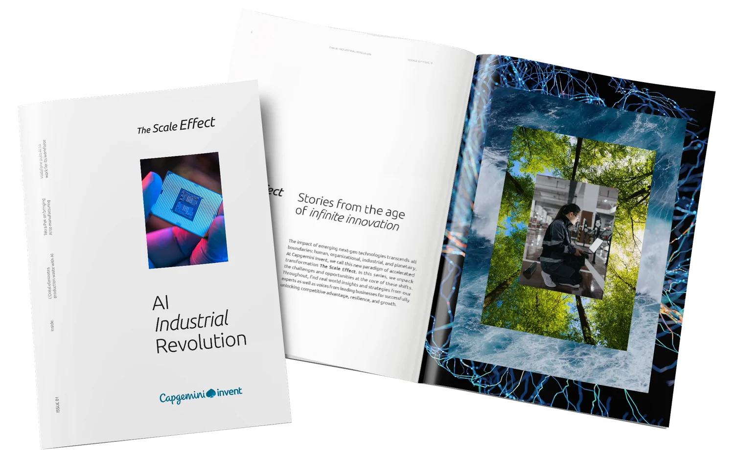
AI Industrial Revolution
Capgemini Invent’s flagship research report: 122 pages, issue 01, built from nothing. Two people designed it, the Art Director and me, and I built and kept the file the whole book was made in: the templates, the styles, and the checks that hold the book together.
What it is
The brief was spoken, not written: it came on a call, and it was three conditions. Build it in Invent’s visual identity. One template per page type, or the book will not ship. And pace the reader, because attention breaks on a schedule: emphasis goes only where the argument has earned it.
This was issue 01, so there was no earlier issue to inherit templates from: every one of them had to be built from scratch before the first page could be laid out.
A flagship publication, issue 01: research on how organisations move from AI pilots to production. Long-form argument, heavy on numbers, which means the layout has to carry a reader through dense material without losing them, and the data has to be drawn rather than dumped.
The two of us worked page by page, and nothing left the file without the Art Director’s sign-off. For part of the project I stood in for him: taking the work and the progress to the team, agreeing what happened next, and sending the copywriters their cuts, longer here, shorter there.
What was mine end to end is the file under all of it: every template built in it and every setting inside, the styles, the objects, the layers and the checks that let two people take the book to print without it coming apart.
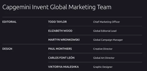
The masthead · page 118
One template per page type
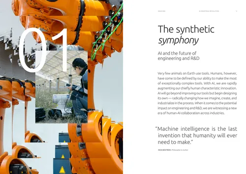
A book this size ships on time only if nothing on it is decided twice. So the issue is not a run of layouts, it is a set of page types, and every page in the book is one of them. The two of us worked the set out, new types and old ones reworked, and each type has a structure of its own. What follows is one of them taken apart, part by part, and then the set in full.
- 01
The collage ground. Photographs offset on a grid and overlapped, so the opening reads as one image built rather than one image found.
- 02
The numeral. Set over the picture, not beside it, and cropped by the page edge: the one element in the book allowed to be this big.
- 03
Running head and folio. The issue on the left page, the chapter on the right, the same two lines on all 122 pages.
- 04
Title and standfirst. Roman and italic in one line, the subject under it. The only place in the book the two faces meet at this size.
- 05
The opening. Running text starts on the opener, so a chapter never spends a whole spread on its own name.
- 06
The pull quote. The opener lands on somebody else’s sentence, and the chapter proper starts overleaf.
This opening survives in draft. It is dated 21 August, the file was signed off on 5 November, and between the two the title picked up its italic and gave back the size, the opening paragraph came up to the full column instead of hanging in a narrow one, the numeral left the page altogether for the collage opposite, and the chapter started closing on a quote.
Draft 21 August
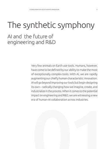
Final 5 November
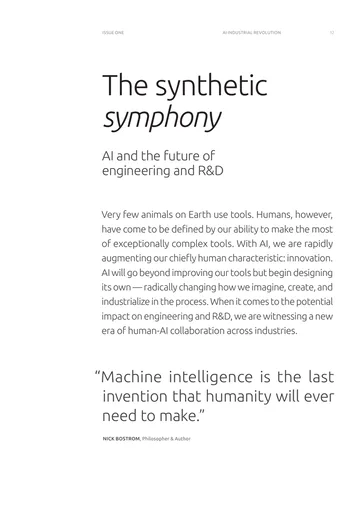
Every other page in the issue is one of these types, built the same way and held by the same file.
- The argument, runningTwo columns, and a label in the margin saying which turn the argument has taken: Challenge, then Opportunity.
- Pull-quote spreadOne sentence at display size with a photograph to carry it, dark across the spread or light with the picture on one page. It carries no new information: it exists to stop the reader.
- A statistic in the columnOne figure set large inside the running text, so the number is read in the sentence that needed it.
- A diagram at reading sizeDrawn on the text grid and set in the text column, in the issue’s own palette, so it never reads as a slide pasted in.
- A full page of dataWhen the figure is the argument it takes the page, on dark, with the source line under it.
- Expert Q&A, the openingA chip that names the format, the question the interview answers, and the portrait. Four interviews, one opening.
- The Q&A itselfQuestion and answer flowing across four columns, so a long interview stays a conversation instead of becoming a wall.
- Client storyThe same chip, a different ground: a collage built for that story. Five clients, five grounds, one template.
- The result panelsWhere a client story lands: icon-headed panels, then the engagement as a numbered table. Layout doing admin work.
- Credits and contributorsTwenty-one names in three departments, on dark. A table is still a layout, and this is the one people check.
- Endnotes and related readingFifteen numbered references with live links, and the reading list beside them. This is where the GREP styles earn their keep.
The quote and the interview spreads took more rounds than anything else in the book. A first issue has no precedent to point at, and the people signing it off were finding out what they wanted by seeing what they did not.
So the work went in versions, and most of them never left the design call: a spread started with many and came out of that call with the few that worked. Those went to the team, where anything that would not survive the stakeholders was cut again, and one or two reached the people signing off. Every new spread template went through all three stages.
One or two at the end, not the whole pile: choosing between versions is design work, and the design was ours to do. What the stages settled on is the pull-quote spread, one sentence set large with a photograph to carry it, dark across both pages or light with the picture on one.
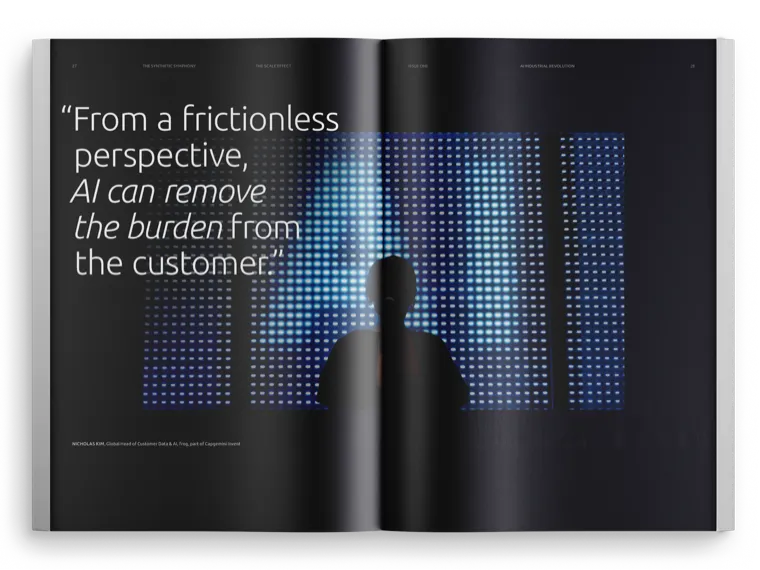
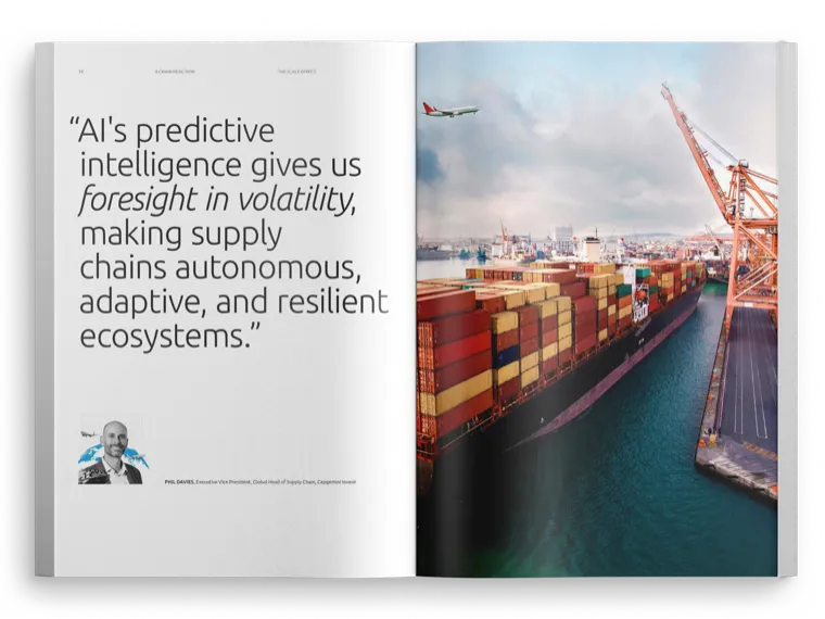
One opening, every format
Four chapters, four interviews, five client stories, and every one of them opens the same way: the same parts in the same order, the ones taken apart at the top of this chapter. What each format keeps for itself is its face, the numeral over the collage on a chapter, a chip on an interview or a client story, and the interview turning the spread round, words first and the portrait facing them. Shared bones, so the book holds together; a face of its own for each kind of page, so a reader always knows which of the three they are reading. The construction never changes, and that is what makes a stretch this long read as one publication rather than a stack of articles.
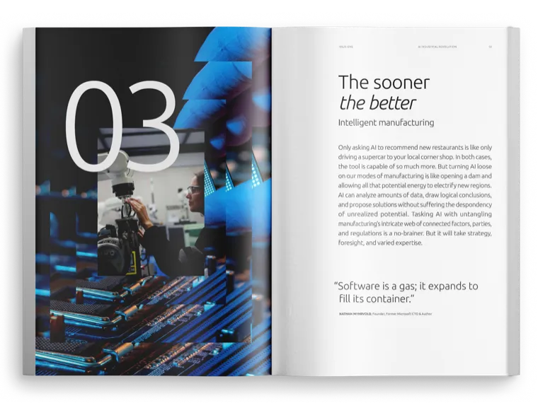 Chapter 03
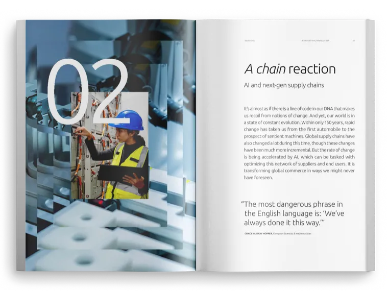 Chapter 02
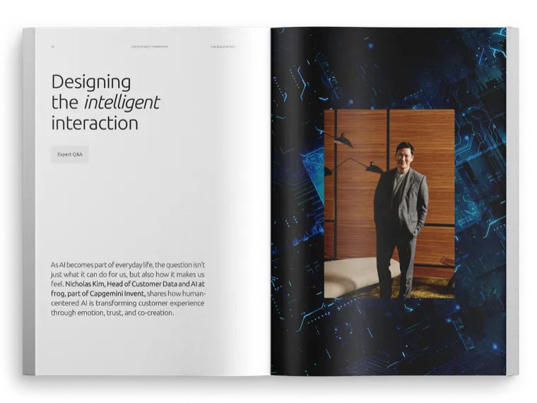 Expert Q&A: Nicholas Kim, frog
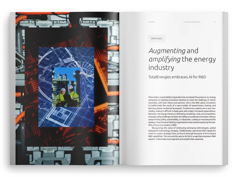 Client story: TotalEnergies
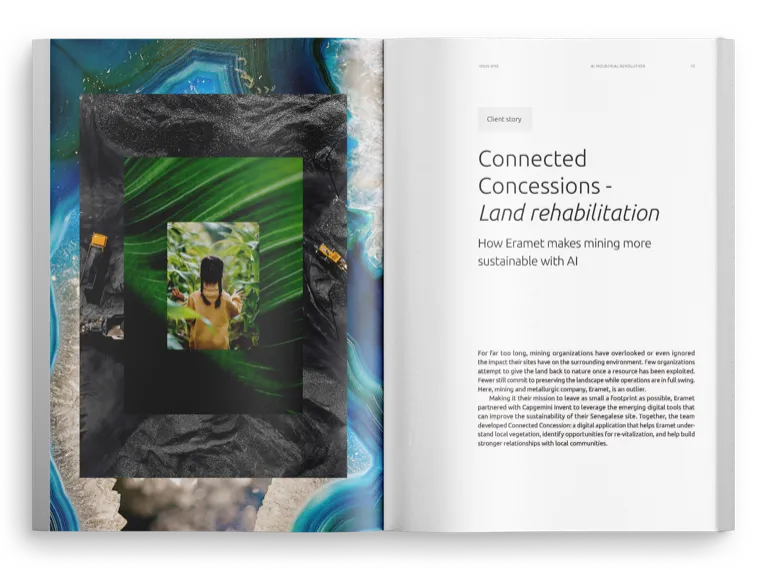 Client story: Eramet
Data drawn, not dumped
The research runs on numbers, and not one of them was placed as it arrived. Everything starts as raw research data and the schemes the consultants send over, and every figure was rebuilt in a chart language of the issue’s own. Three rules make that language, and every chart in the issue is held to all three.
- Two colours, the accent and blackNo third one, because a third is where a chart starts making noise instead of a point. These are the two the text is already set in, so a drawing belongs to the book rather than visiting it, and the accent is spent on the value the chart was drawn to make.
- One line weight, everywhereEvery outline, leader and rule is drawn at the same width. Nothing in a drawing can claim attention by being heavier than the line beside it, and nothing on it competes with the page around it: emphasis is the accent’s job, and it is the only thing here allowed to raise its voice.
- To be understood, not to interruptSized to the text it belongs to, set into it, and named and sourced in the same hierarchy as the prose. It is not a break in the reading and not a change of pace, because pacing and relief are the openings and the quote spreads, and they are already doing it.
Somewhere inside it the rule surfaced that I now take everywhere. In information design, less is more is not taste, it is function: the fewer moves a page makes, the further the reader gets.
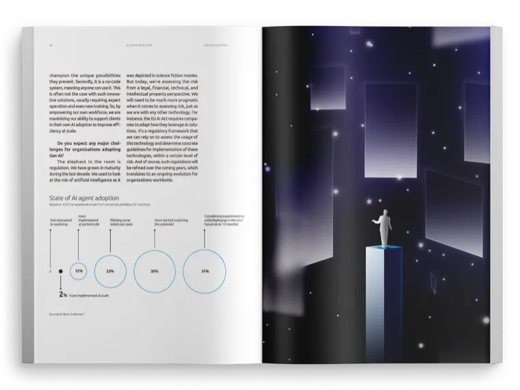 State of AI agent adoption
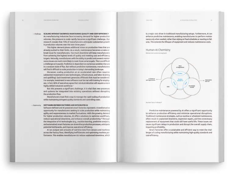 Human-AI Chemistry, at reading size
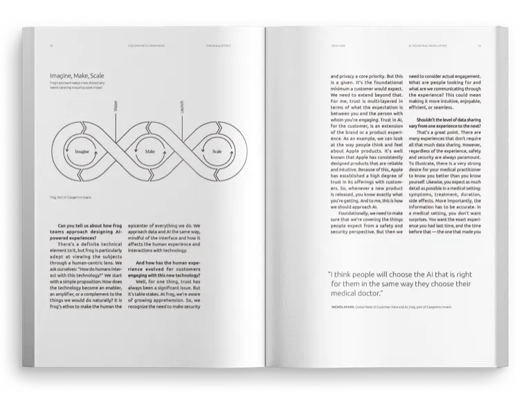 Imagine, Make, Scale
 A statistic at display size
122 pages only hold together if the grid, the charts and the light all come from the same decision.
The system in the file
A book this size cannot be hand-set, and the issue after it should not have to be. The rules live in the InDesign file, not in anyone’s head: parent spreads for every layout in the book, a paragraph and character style for each level of the hierarchy, GREP styles that clean the typography as the text flows in, and a live preflight that keeps 122 pages at zero errors. Handing the file over is handing the system over.
Thirty-nine paragraph styles, because every kind of paragraph in the issue has one of its own, down to the difference between the first paragraph of a section and the ones after it. Nothing is applied by hand, and the styles know what follows them: the quotation style names the one the attribution under it takes, so that line is set before anyone reaches for it. Type is set by the style and not in the frame, so the words can be rewritten, the frame moved and the structure of a page rebuilt without any of it touching how the type looks. That is what makes the file outlive the person who built it: it is complicated, and it is built so that someone who has never seen it can work in it without breaking it.
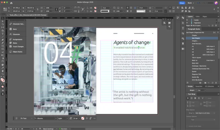
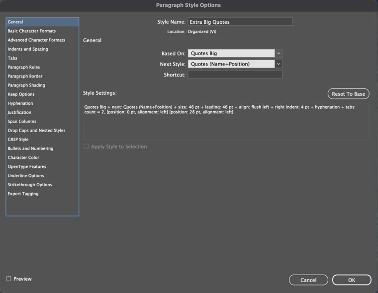
A style does not only say what a paragraph looks like, it says what the next one is. Extra Big Quotes hands over to Quotes (Name+Position), and inside that style a GREP pattern takes the opening words of the line and sets the name apart from the job title behind it. Type the quotation, press return, type who said it: every part of it is styled before anyone has chosen a style. The same link runs through the body, where the style that opens a section hands over to the one that continues it.
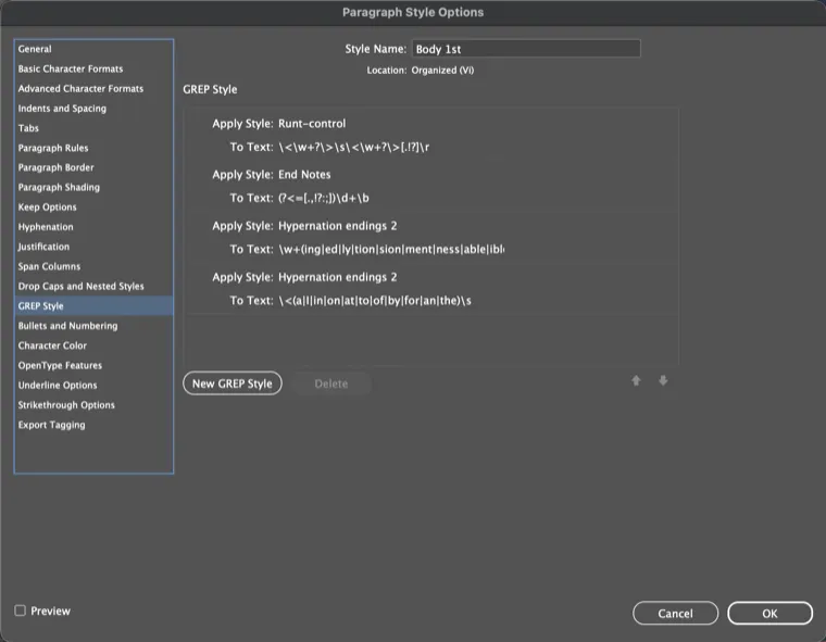
Four patterns live inside the body paragraph style: one stops a paragraph ending on a single word, one styles the end-note numerals, and two keep hyphenation off word endings and short words. They apply themselves as the text flows in, so a stranded word or a bad break is caught by the file rather than found by a person reading 122 pages for it.
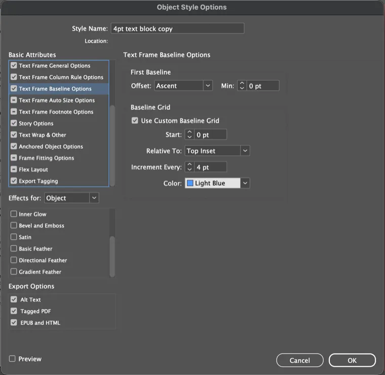
A text frame carrying this style brings its own baseline grid: 4 pt increments measured from the frame’s top inset rather than from the page. The page grid is set to the body text and is far too coarse to hold a caption, and a grid that belongs to the frame travels with it wherever the frame is put. Applying the style is the alignment: nothing is nudged into place, and one edit to the style reaches every frame carrying it.
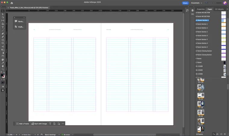
Nineteen of them, an A and a B for every section of the issue, the closing pages included, plus the covers. A parent holds everything a page has before anyone designs it: margins, columns, the baseline grid, the running heads and the page number. That is why the spread on the canvas looks empty and is not, and why nothing in the book is set up by hand: what changes for a whole section is one edit to its parent, not twenty pages of the same edit. Each section’s pair carries a colour of its own, so 122 pages scroll past the Pages panel as bands, and a spread cannot quietly end up in the wrong one.
The working profile runs while the file is being worked in rather than over it at the end, so it watches all 122 pages and reports as the page is being built. It catches the things that sink a print job: a link gone missing or changed underneath you, text that no longer fits its frame, a font that is not on the machine. Here it has nothing to say, and the Links panel beside it counts 154 placed files, Getty and Adobe Stock frames, Photoshop and Illustrator documents and photographs, every one of them present and current. The green dot in the corner is the difference between a book that is ready and a book that has to be checked before it can be.
![InDesign working view: the [Basic] preflight panel reporting no errors across all pages, and the Links panel counting 154 placed files](/assets/img/scale-effect-indesign-preflight@sm.webp)
Carried through to launch
A report that only exists as a PDF gets read by the people who already knew about it. I cut a launch animation from the issue’s own key visual, and the web design team built the landing page from the same system, so the visual language that opens the publication is also what a reader meets first on LinkedIn.

What the Art Director said
The Art Director on this issue signed off every page in the book. This is what he wrote about the work in a public recommendation.
She brings design sensitivity and thoughtful reasoning to her work, with particular strengths in editorial design. Global Art Director, frog · LinkedIn, August 2026
What I would still change
The file was solved. The way text got into it was not. Copy came to us as documents, and every change was a request: I asked for a cut, the copywriters rewrote it, I flowed it in again, they reviewed the result in a PDF. On a book this size that loop runs hundreds of times.
InCopy would have removed it. The same InDesign file, opened by the writers in their own editor: they write into the real column, at the real size, and watch the line breaks and the overset as they type. Design keeps the layout, editorial keeps the words, and nobody waits on anybody to find out what a sentence does to a page.
I would build the next issue that way from the first spread. The system was already in the file. The writers were the only people it never reached.