Graduation project · PJAIT Warsaw · Brand from scratch
Éclarén.
Built end to end
A premium cosmetics brand built from scratch as my graduation project: competitor and audience analysis, positioning, the name, the identity, packaging, guidelines, 3D and the product shoot.
A brand that had to exist
The diploma brief was open: any brand, any category. I picked premium skincare, which is the most crowded shelf I could have chosen, and I set one condition of my own. The brand had to exist as objects rather than as slides.
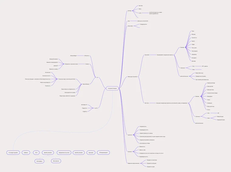
That condition came out of the thesis it belonged to, Brand Building Blocks and the Role of Brand Design Blocks. A paper about the blocks a brand is built from cannot hand in a presentation of blocks. So the first half of the project is not design at all: category and audience analysis, a positioning territory, and a board every later decision had to answer to.
The concept map · category, audience, territory
The name, and the three that lost
The board answered two questions before anything was drawn: what the category already sells, and what this brand would be about. The answer to the second was naturalness, and one line off the board survived all the way to a carton: make-up as a second skin.
That line is not something this page invented in hindsight. The brand book at the end of the project states it as a promise, in the brand’s own words: the cosmetics are not a mask but an invisible veil over the face you already have, and what the brand sells is exclusivity rather than mass appeal.
Two words blended into one: Éclat – brilliance, and Seren – star. Together they make the promise the brand runs on: whoever wears it shines like a star. Of the four names on the board it was the only one that was not already a word, which is the practical half of the choice, because an invented name is one nobody else owns. It was also the only one with an accent in it, and that accent is what made the name drawable. Everything the identity does afterwards comes out of that É.
Of the three that lost, Two Face went out because a name close to it already existed, and La Da borrowed its meaning from Lada, the Slavic goddess of beauty.
Names · options
Name · made of
ÉclarénA shining star ÉclatBrilliance SerenStar
The identity
An identity is a system when one decision forces the next. Here that decision is the accent: the face was kept for the acute it gives the É, the acute becomes the symbol every carton has to carry, and the type pair and the colour ramp are chosen to sit under that shape rather than beside it. The logotype, its short form and the symbol are then one construction at three sizes, not three marks that look alike.
The logotype: the faces it was tried in
The name had to be drawn before anything else could be, and this is where the project stalled longest. The same word was set over and over. Six of the trials are here: three without the accents, three with them.
Classico URW is the one I kept, and then redrew: a hint of serifs without being formal, and an acute that is a shape rather than a mark of pronunciation. That is what the rest of the identity is built from. The É leaves the word and becomes the symbol, the acute leaves the É and becomes the smear of cream, and the smear is what ends up on a cap, a seal and every carton in the range.
 Tacitus Light
 Dashiell Text
 Classico URW · kept
 MADE Mirage
 Akzidenz Grotesk Pro Ext
 Source Serif Variable
The identity in one sheet

 The wordmark
 The symbol
 The smear
Three crops of one drawing, each lighting the part the next one keeps: the wordmark hands over its É, the É hands over its acute, a smear of cream, the one part that carries the brand alone, on a cap, a seal, an app icon.
Three colours are named in the book, each for a reason and each running a line:
- Deep DarkFor austerity and expense, on make-up
- Healing PurpleFor elegance and clarity, on Repair+
- Pure WhiteFor neutrality, on skin care
Under them the book keeps five further tints and the same colours at reduced opacity, and the ramp is the seven steps that came out of that, so a pack, a page and a screen all draw from one set, and a shopper can tell the lines apart before reading a word.
The book locks four versions of the mark, not one. The full logotype is the default; the same logotype with cosmetics + under it belongs to the therapeutic line and to nothing else; the short wordmark drops the descriptor where a pack is too small to carry it; the É stands alone where even the word will not fit. Which line a product belongs to is settled in the logotype, before the colour says it a second time.
Anatomy and clear space
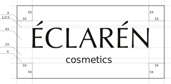
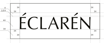
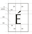
A brand book is written for the people who were not in the room. The mark will be handed to a printer, a marketplace, a partner’s deck and whoever runs the account next year, and every one of those hands has a good local reason to crowd it, stretch it, rotate it, or tidy the accent away. The three don’ts make that checkable in a second rather than arguable for an hour: each of them turns the mark into something that is nearly it, and a brand that is nearly itself in fifty places has stopped being one.



The brand book, printed
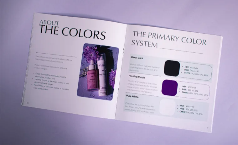
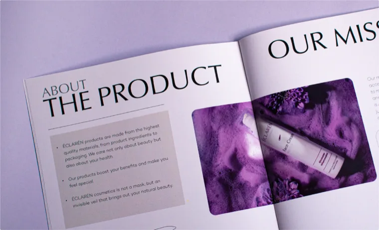
Softness and confidence are the keys to this brand: every decision after the name is just holding those two things at once.
Packaging
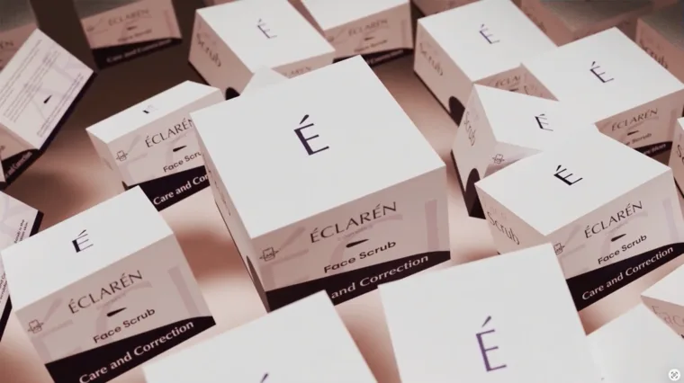
A carton is where the system stops being a document and becomes an object somebody holds. Everything on it continues a decision already made: white primaries so the purple can do the signalling, the logotype at three sizes so a cleansing oil, a foundation and a serum read as one shelf, the acute’s smear naming the product before the type does. The pack is drawn as carefully as the mark was, and it is drawn to agree with it.
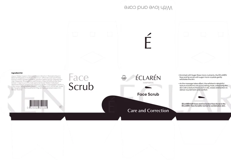
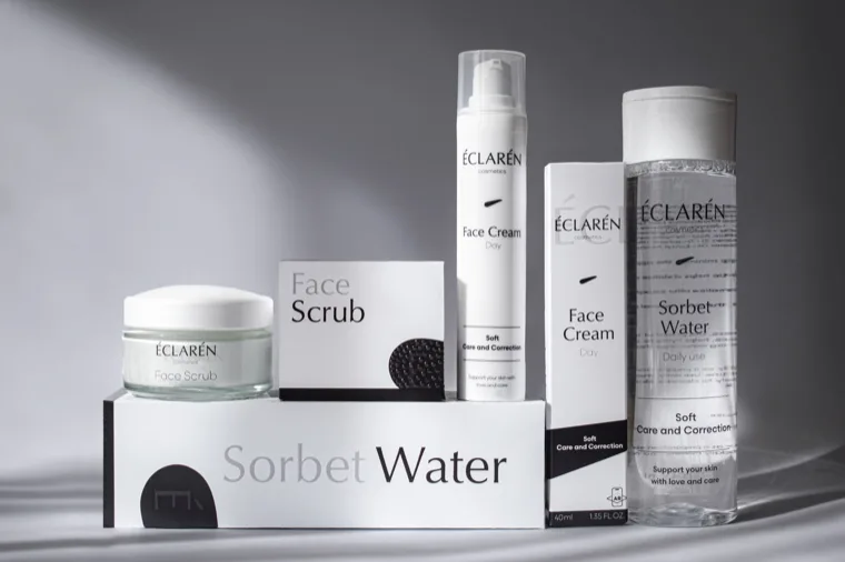
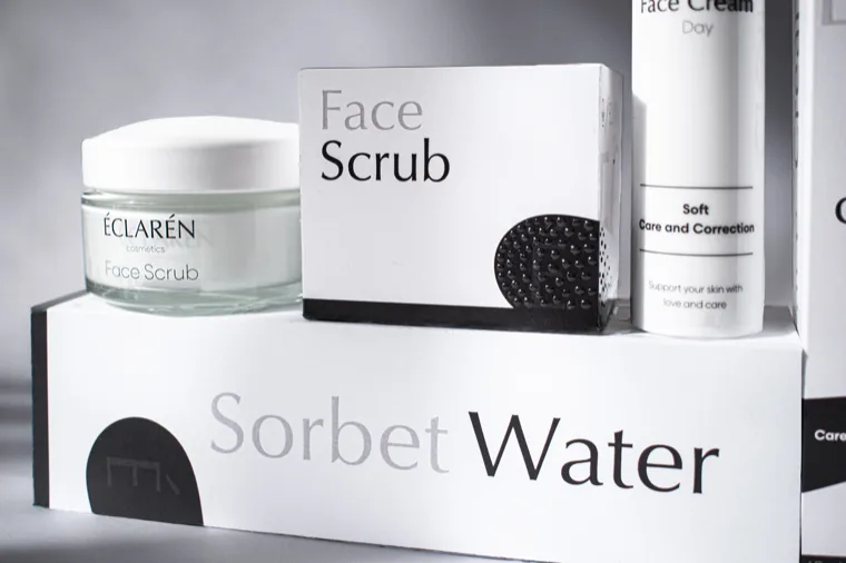
The idea under it is one a shelf almost never offers: a pack you remember with your hands. A textured varnish carries it, so touch is added without the drawing being changed. Bumps across the scrub’s smear, for the grains in the jar. Waves on the cream, for what a cream does under a finger. A hard gloss on the Sorbet Water, for the skin it promises. Each line ends up with a surface of its own, and a hand that has held one of them knows the next one before the eyes arrive. Below is one carton worked through in full, panel by panel.
- 01
Face. Logotype, symbol, product name: what has to survive a shelf.
- 02
The symbol. The smear from the logotype: cream on skin, in the product's colour, so the mark names it before the type does.
- 03
Side. The name again, largest of the three sizes: packs are seen edge-on.
- 04
Back. Ingredients, barcode and volume, kept to one column.
- 05
Tuck flap. “With love and care”, for whoever opens the box.
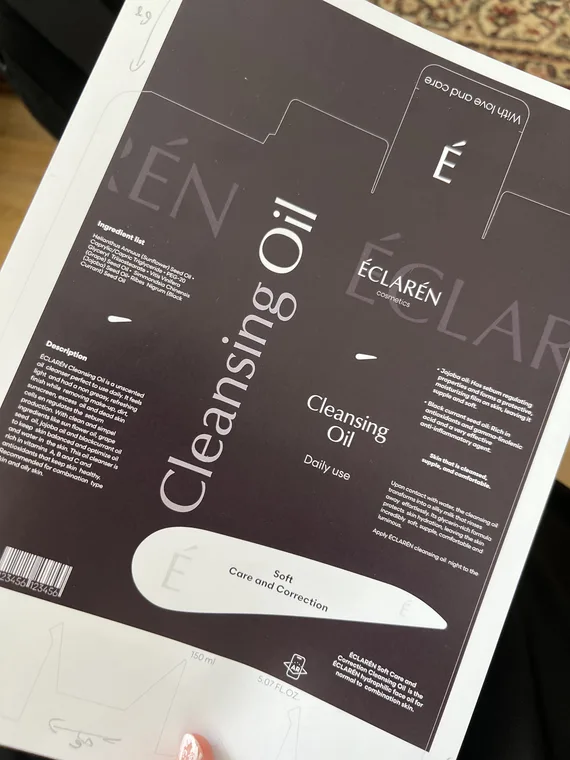
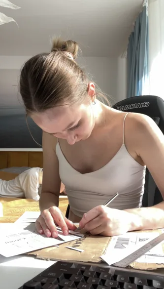
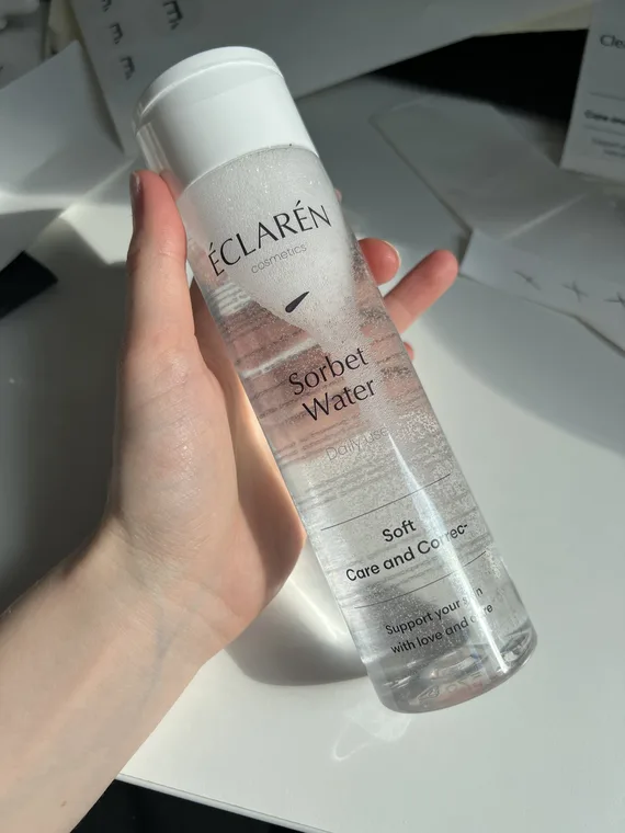
The finish is where the drawing met the printing trade. Nobody runs a varnish like this on twenty cartons: it is set up for print runs a diploma cannot pay for, and what was offered instead came back flatter, or with the wrong sheen, or as a substitute that would have turned the idea into a caption rather than something a hand can find. So the finishing moved to my desk. The artwork went out as flat sheets, and everything after that was hand work: cutting the dies with a scalpel, scoring, folding, glueing, and applying the labels to bottles sourced to match the drawing. The texture went on last, in clear varnish laid by hand and cured under a UV lamp, one carton at a time, which is a print house’s spot finish rebuilt at the scale of a desk. The packshots below show a production line that was one person at a table, which is what it cost to keep the surface the design asked for.
The range in 3D
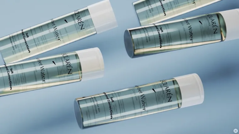
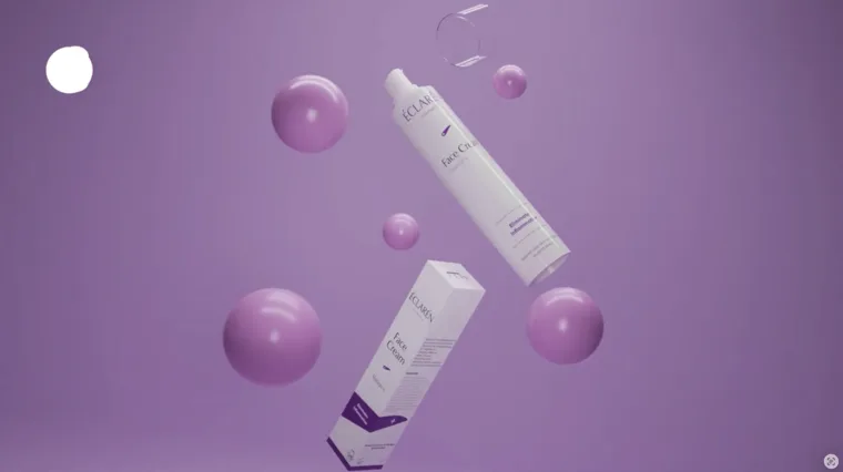
The film was part of the diploma rather than a flourish on top of it: the degree ran on two tracks at once, 2D and 3D, and both had to be in the work. It suits what was being shown, because a film of static packs is either a camera move or geometry. So the range exists twice. Every pack was modelled and rendered carrying the printed artwork, each line on a ground of its own, and the presentation that closed the defence was cut from that. Modelled and rendered in Blender, and cut together by me: it is a diploma, so every frame of it is mine, the same way every carton on the table above is. The 3D half of the course, spent on the brand the 2D half had built.
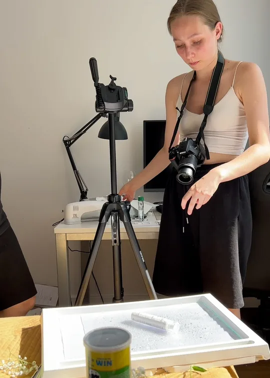
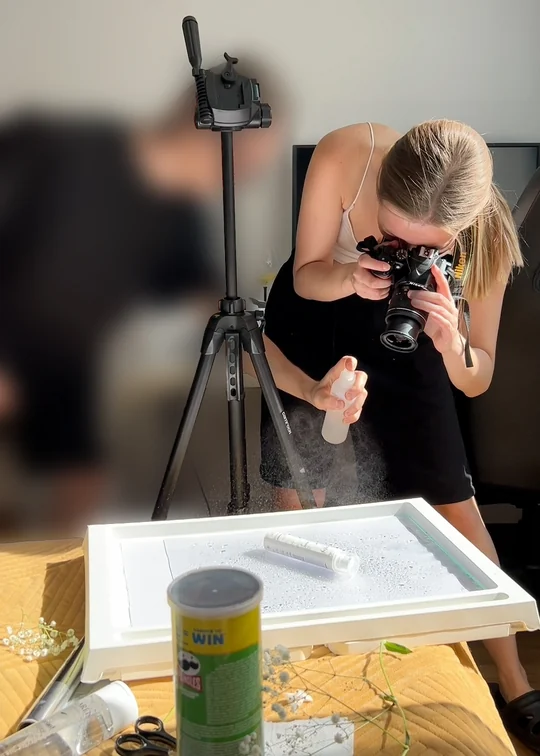
The shoot
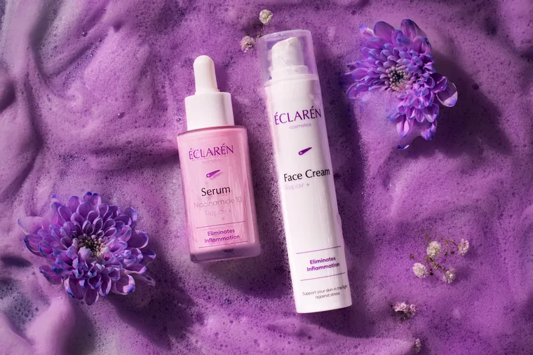
Then as physical product, and every frame of it taken at home on a Nikon: no studio, no rented lights, no set. What a studio would have supplied, the flat did. A food tray on the bed, flooded, for a set. A sheet of glass. A desk lamp for the only light and foil for a reflector. A crisps tube holding a bottle upright. Water, foam, flowers and paint for the rest. I shot it with one person helping on the water and the props. Nothing here was rented, and none of it is in the frame.
Three lines, three sets: Skin Care on water and lilac, Repair+ in foam and chrysanthemums, Make-up on wet black stone. Each line keeps the surfaces of its own colour, so the ranges stay as separate down the page as they are on a shelf. What that kit was capable of is the rest of the chapter.
Skin Care
Repair
Make-up
The defence
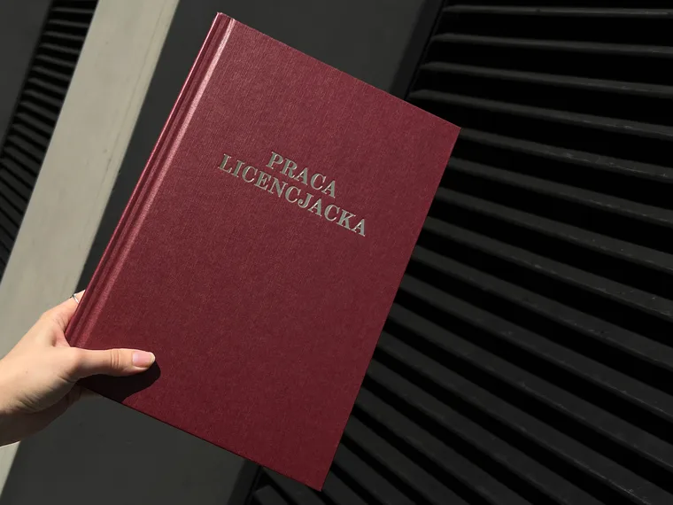
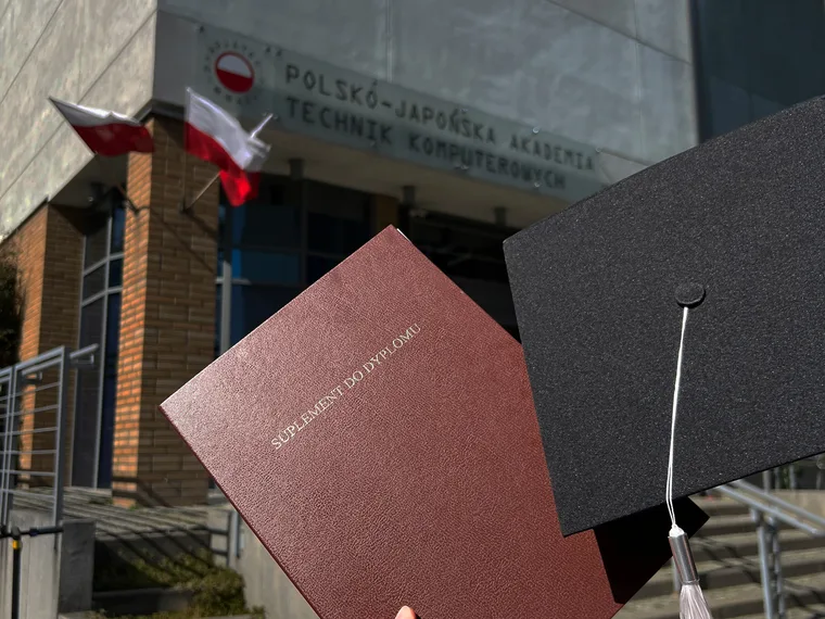
Brand Building Blocks and the Role of Brand Design Blocks: handed in at PJAIT Warsaw in June 2023 and defended with a 5, the top mark. What the panel came back with was that it was an enormous amount of work, and somebody came up afterwards to ask for my details.
What I would still change
Two things. The jars are the compromise: the shapes I drew did not survive the budget, so the range stands in stock glass that the drawings had to be fitted to. And there is too much text on the packs. I would cut it by half, and most of the varnish with it.