Beauty · Brand system · 2023–2025
Farmasi.
500 SKUs, one system
A direct-sales beauty brand selling in 50+ countries. I built the catalogue and the brand system for Poland, Czechia and Slovakia end to end (150+ pages covering 500+ SKUs, three product guides, the daily storefront that sells them, and the 3D product films), concept through to final print-ready files.
What it moved
The brief was spoken, not written: the catalogue needs to look current, and it needs a format that survives the web viewer. That could have been a resize, and online it was one.
I made the case for rebuilding the catalogue itself (the templates, the icon language, the palettes, the covers), and the resize became a redesign, with two months to ship the first issue and a photo library that did not exist yet: the product photography lived with designers on other markets, and I chased it down contact by contact.
A 500-SKU catalogue is not a design problem, it is a production problem. I took all 6 issues from prepress to print, and the only way that happens without collapsing is if the rules live in the file rather than in someone’s head.
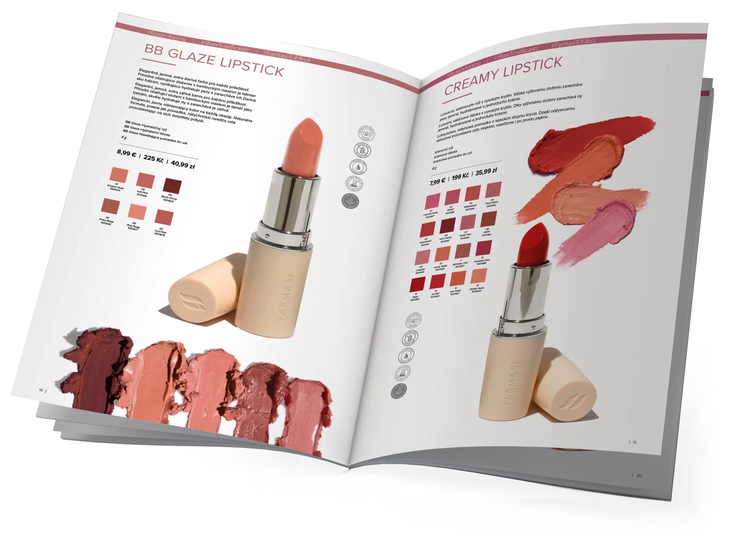
Catalogue of products: one template per product type
Farmasi’s lines are not chosen alike: a lipstick is picked by shade, a serum by claim, a fragrance by note. So the catalogue is not one layout repeated across the issue but a template per product type, all of them built on the same grid, the same icon language and the same typographic scale. What changes between the families is what a shopper has to compare, and everything else holds still.
The cover: one story on the front
The cover was the longest argument of the project. The instinct I was arguing against wanted a newspaper front: every offer on it at once, nothing on it readable. I held out for a magazine cover, one story on the front and the rest inside. The clean cover won, and the influencers who sell from the catalogue were the first to call the new book what it was: current.
Before

After
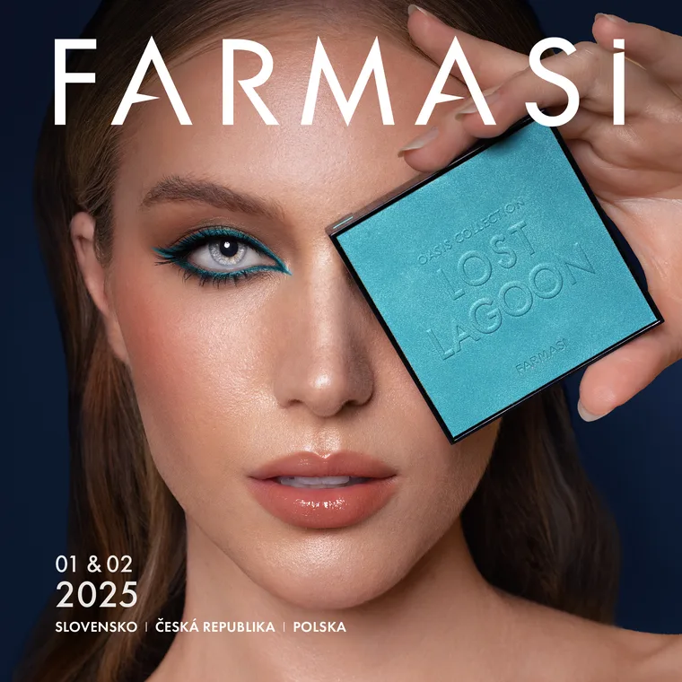
The clean cover outlasted the argument: every issue since has carried it, and Farmasi prints it that way still.
The same spread, three times over
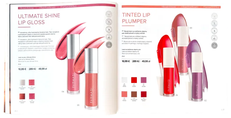
The catalogue is read twice: on paper, and far more often on a phone, because a link is how a consultant sends it. The old edition was square on both, and on a screen a square page arrives small, with the copy scaled down with it. The online edition was rebuilt at 2:3, a page that fills a phone instead of floating in it. Print keeps its square: it was never the thing that needed fixing.
Before
After
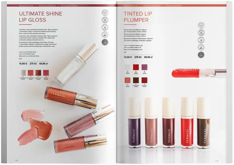
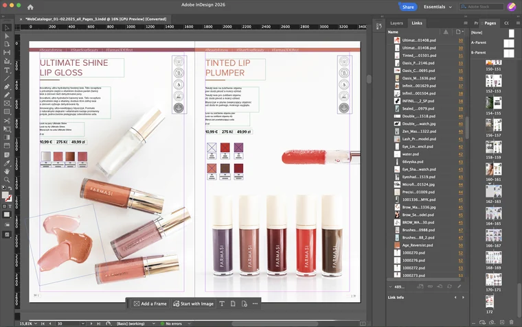
489 placed files sit behind this issue, each named for what is in it, a product by name or by SKU code and a texture by the thing itself, with the page it lands on beside it: a photograph is found by reading the list, not by opening files one after another. Nothing is missing or out of date and the preflight reports no errors across all 172 pages, so the issue is ready to send on any day rather than after a week of tidying. The claims frame holds Slovak, Czech and Polish at once, because one spread ships to all three markets.
The working file
Makeup: the template in use
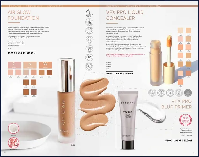
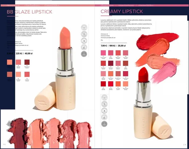
Every SKU family got a repeatable layout with fixed positions for shade grids, claims, icons and price. Once the template holds, laying out a new product is filling in fields, not designing a page, which is what made the volume possible. Complexion, eyes and lips each get their own variant of it, and a spread can carry two SKU families without the reader having to relearn anything.
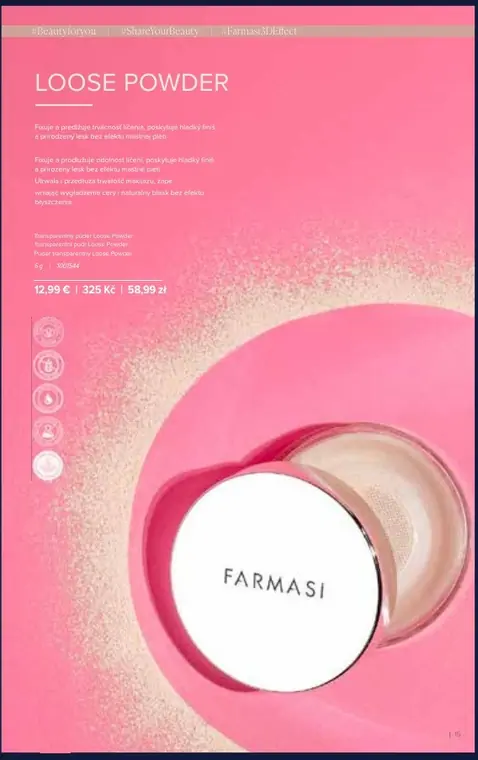
The template clicked when I stopped treating the ground as background: the colour field, the props and the product are set as one composition, so the page carries the context the old grid left to the caption.
 Contour and blush: where the model carries the page
 Complexion: CC Color Control, BB Beauty Balm
 Foundation and concealer: Air Glow, VFX Pro
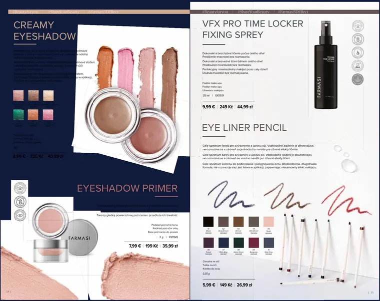
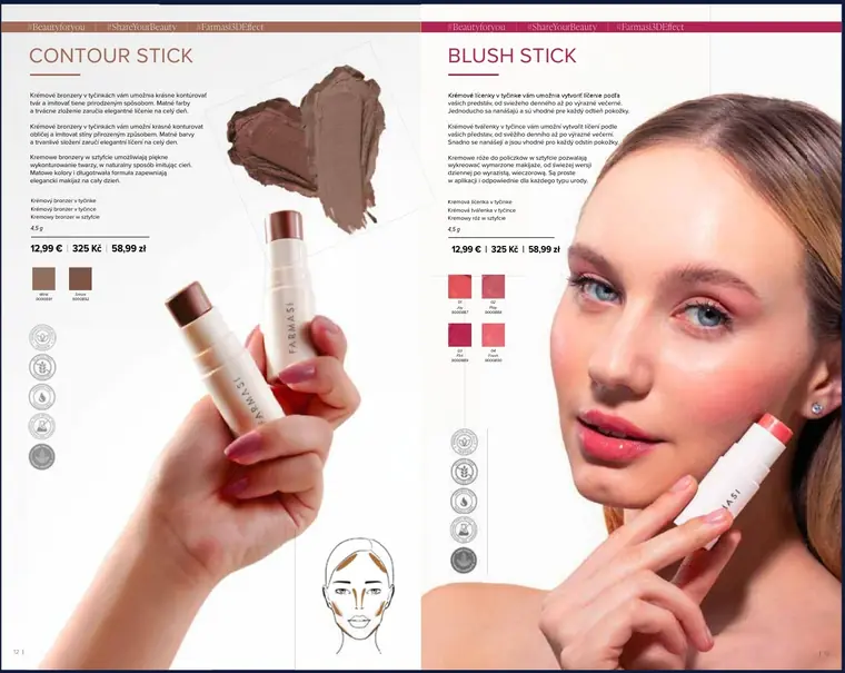 Eyes: four SKUs on one spread, one icon set
Skincare and body: one icon language, a palette per line
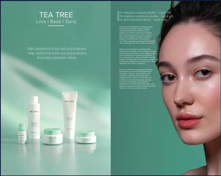
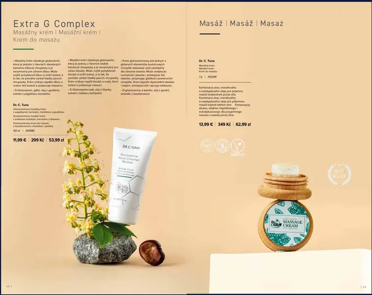
Certification icons, skin-type markers and benefit claims were unified into a single set, so a shopper reads the same signals on page 12 and page 140, and so the catalogue stays translatable, since the same pages ship in three markets. On top of that shared language each line carries its own palette and shooting treatment: the green Tea Tree range reads differently from Lavender while still being one catalogue.
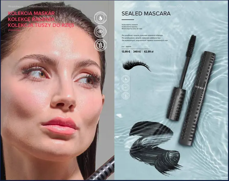 Tea Tree: green, clinical, one model close-up
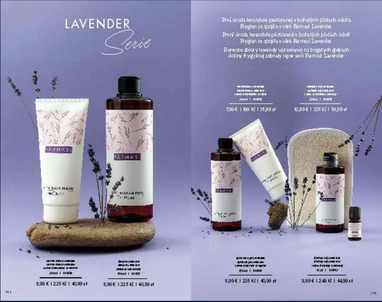 Lavender: lilac, still life, script display type
 Extra G Complex and massage cream: sand, botanical props
 Absolute and Hydrogel: pale blue, product only
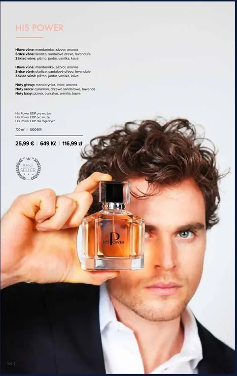
Fragrance: the page stripped back
Fragrance is the one family that drops the shade grids and the icon strip entirely. What is left is the bottle, the note pyramid and the price, so the page is carried by the ground the bottle stands on, and each scent gets its own. The Masculine line belongs here too: it runs wider than a fragrance page, but the parfum is what anchors it, and the black ground it sits on is set by the scent rather than by the shower gel.
The rules live in the file, not in someone’s head: that is how one designer took all 6 issues of a 500-SKU catalogue to print.
Three 50+ page guides for the people who sell
Farmasi sells through consultants, not shelves, so the person explaining a product is rarely a specialist. These guides translate formulation and usage into something a distributor can learn quickly and repeat accurately: ingredient breakdowns, application steps, comparison tables. All three were approved by the local CEO, and influencers worked from them as well as consultants.
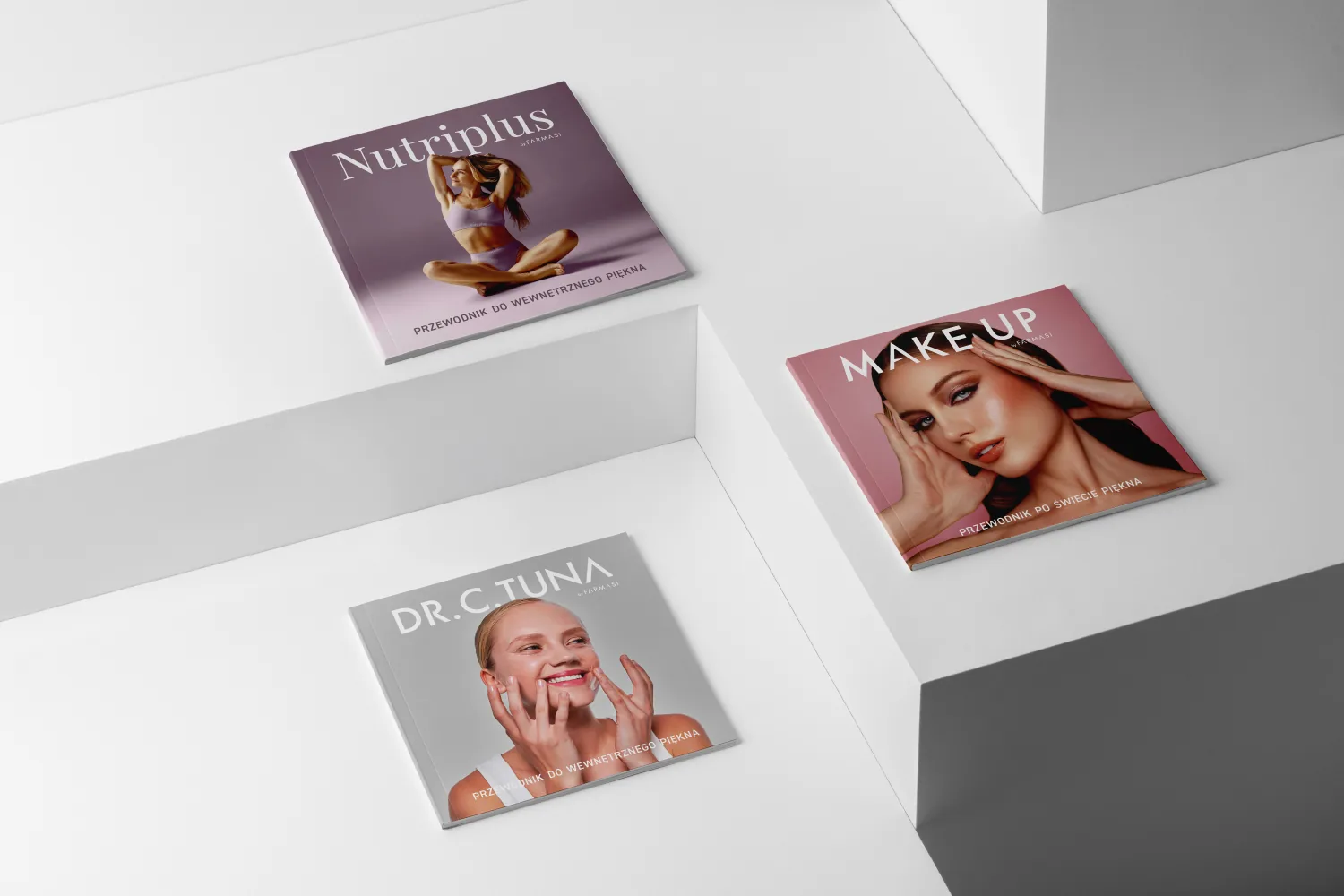
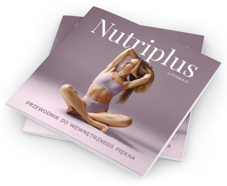 Nutriplus: the cover of the consultant guide
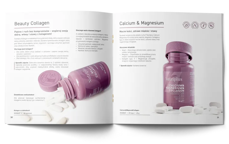 Beauty Collagen and Calcium & Magnesium: one product per page, same skeleton
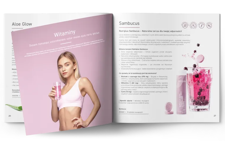 Aloe Glow and Sambucus: benefit list, key ingredients, dosage, in fixed order
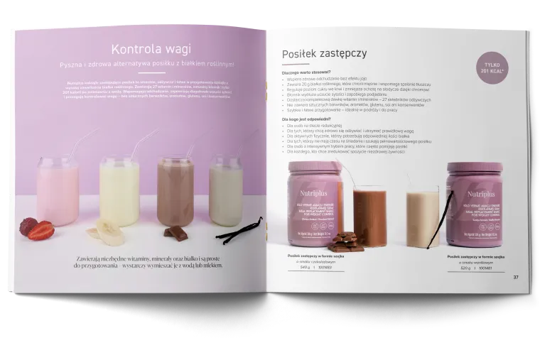 Weight control and meal replacement: where the guide has to sell a routine, not a jar
Modelled, animated and cut in-house
Until this range, a product film here meant stock footage or a cut handed down from another market. The ask was for something new. I proposed building the films ourselves, in 3D, because a render can hold what a shelf photo cannot: the texture of a gummy, the pour of a serum, the feel of the product rather than the pack. The answer was yes, and the schedule stayed what it was: one week from brief to delivery, per film.
The Nutriplus film was the first ever made for the CE market. The launch built around it made the range a category bestseller within a month, in a format other markets then replicated, a first for the brand.
3D films for the product range
Product films were built in Blender rather than commissioned out: modelling, cloth, fluid and particle simulation, rendering and post. The Nutriplus gummies launch was designed end to end around one of them: the 3D film, the launch presentation and every campaign visual. All three play here, no need to leave the page.
When the Global CEO next visited Poland, he sought me out to shake my hand for the film.
Vertical films for the feed
The fragrance films are the other half of the job: vertical, sound on, made for the feed rather than for a landing page. They start only when you press play.
The daily banner system
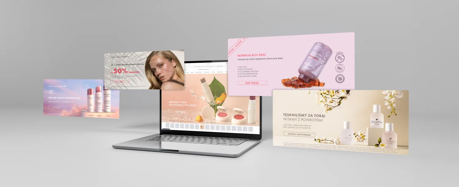
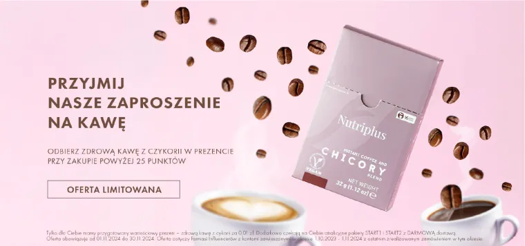
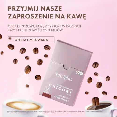
Promotions change constantly, so banners had to be produced fast without drifting off-brand. Web and mobile crops are designed together from one layout, so the same hierarchy holds at very different proportions. The same rules run the product card templates and the web catalogue, in Poland, Czechia and Slovakia.












What I would still change
Two things I would still change. The catalogue ships all three languages on one page, and I hold that each market deserves its own edition. And the films carry library music: the right track existed, the licence did not.