frog · Capgemini Invent · Editorial series
Design Mind.
One voice, 8 issues
Design Mind is frog’s editorial publication. I was the sole designer on every article and episode published between June 2025 and August 2026: layouts, covers, key visuals and their animation, 3D, illustration, the explanatory graphics that carry the argument inside each piece, and the social cutdowns. I defined the illustration system underneath them from scratch, so eight different subjects read as one publication.
Published on frog.coThe problem an editorial series has
Every article arrives with a different subject and a writer who needs it this week. Answer each one on its own terms and you get eight good images that belong to eight different publications.
So the work is not illustration, it is a language, and the publication did not have one. Every piece is about the same three things: people, AI, and what happens between them. So people are always drawn as a living element (a figure, a hand, a strand of DNA, a pair of hands around something) and AI as an artificial one, which is to say an abstraction: fields, bars, gradients, glass. The frame is the two of them meeting. One kind of living thing to a visual, never two; one light, one palette, and everything moves.
The living element broke with the company’s abstract identity, and the first reviews could not see how a person fits without breaking the system. One sentence ended it.
None of these articles are about AI. They are about people.
Before the language, each article was answered on its own terms: a collage, a flat illustration, a ribbon pattern. Three lights, three palettes, nothing shared.
Before · earlier issues
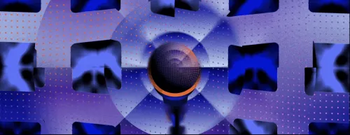


Issues from before the system; these three are not my work.
After · the rule applied
The three issues on the left are not mine. Neither is the judgement that they read as three different publications: this is a copywriter on the series, in an internal feedback round in July 2026.
I believe that a person can look at the brand’s style before Viktoryia joined the team and see a clear difference. A copywriter on the series · internal feedback, July 2026
How an article becomes a picture
One article followed from the brief to the render: Amplifying Clinical Healthcare with AI. Every illustration in the series is made this way.
Healthcare innovation is usually approached as separate solutions, but healthcare works as one interconnected system, more an orchestra than a solo. The patient experience is the main melody; the clinician experience is the rhythm that sustains it; processes are the score that coordinates people, information and decisions.
AI is not the conductor. It is an enabler: it connects signals, anticipates bottlenecks and takes weight off clinicians without replacing their judgment.
Keywords, as given healthcare innovation · patient experience · clinician experience · operational processes · service design · artificial intelligence · workflow integration · augmentation, not automation · human-centered design · system coherence · AI as an enabler
The orchestra is the article’s own: melody, rhythm and score arrive with the brief. What does not arrive is the picture: what a melody looks like, which living thing stands for a patient, what holds both in one frame. That part is mine, and everything below is it being decided.
The first pass is words and not pictures: plain associations with the article, written out before anything is drawn. The three in colour are the ones that describe it best and the focus went to them; the other seven describe it just as truly.
Each of the three then gets a search of its own, for the picture that will stand for it.
AI inside medicine, so the living element had to be a body as a machine sees it: a fingerprint, a scan, a breath, DNA.
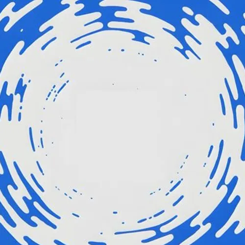
Harmony is the artificial half, the AI: currents, streaks, fields, movement without a machine.
System is what holds the two together: grids, arrays, stacks.
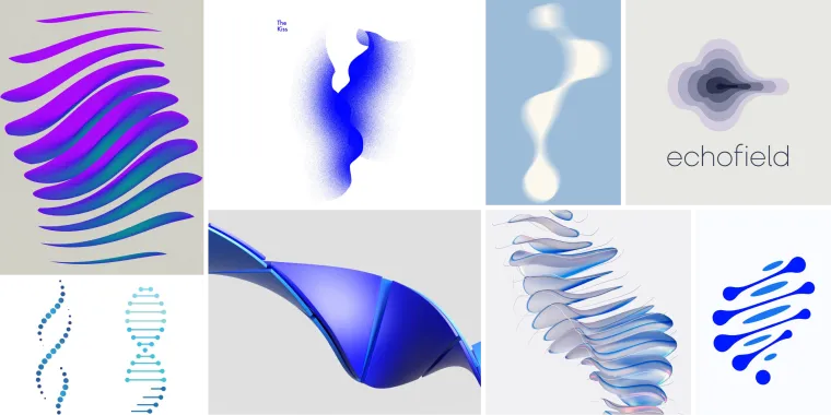
It came down to DNA, the flow and the plates.
References collected for direction; the images here are not my work.
Human · options

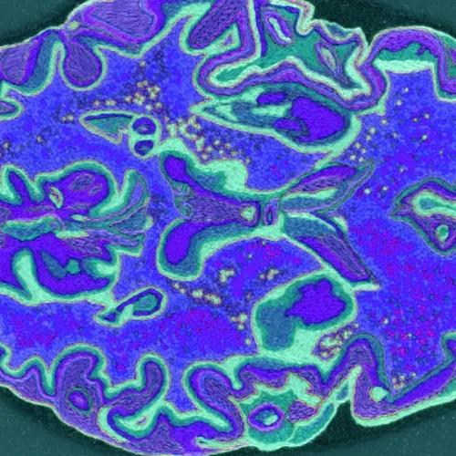
Chosen

Harmony · options
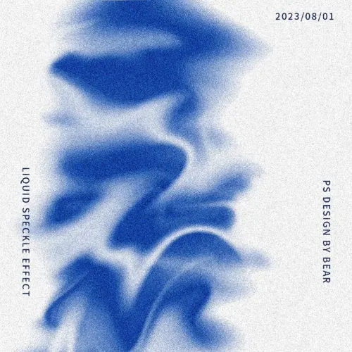
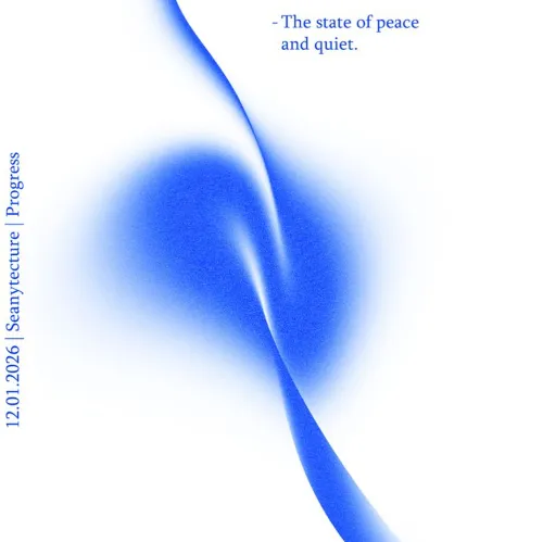
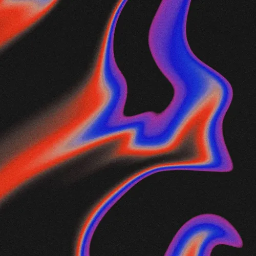
Chosen
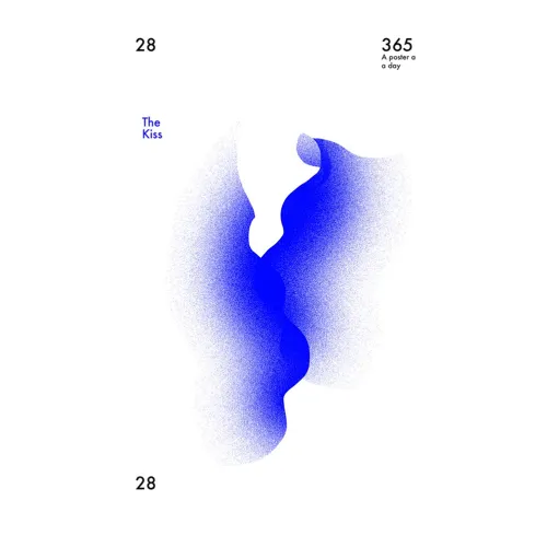
System · options
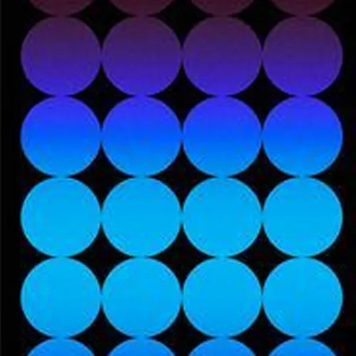
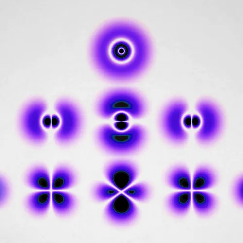
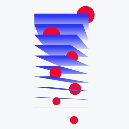
Chosen
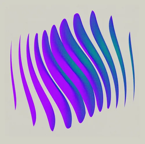
A mood board is where a direction can be looked at instead of described: the three answers on one surface, in the light and colour they will be built in.
It is also where the idea is agreed with the team. Sign-off happens on the board, not on a finished render: everything after this point is production.
References collected for direction; the images here are not my work.
The form is one group of 22 plates turned through 360°, so that in motion the run of them reads as the coil of a DNA strand. Everything else in the scene is a copy of that parent group: the form stays one edit rather than twenty-two.
The loop is the hard part. The turn has to come back to the frame it started on with nothing showing at the join, and that is what fixes how many plates there are and how far each one is rotated.
The shader editor is where the plates get their texture and their colour. The lamps and the camera in the viewport are not staging: the form only resolves into a melody from one angle and under one light, so both belong to the object rather than to a view of it.
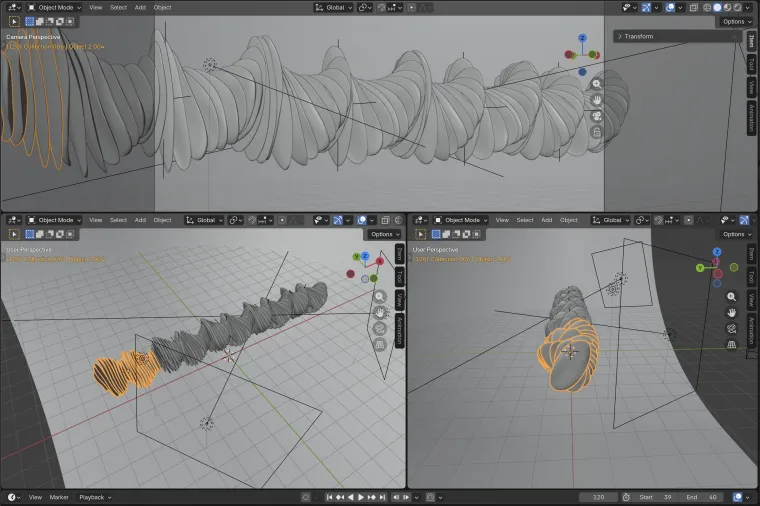 Blender: three viewports, the lamps and the camera
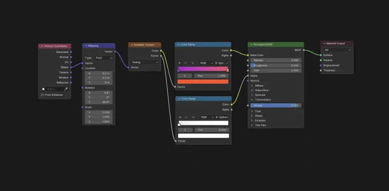 Blender: shader editor, the plates’ texture and colour
Brief, words, references, board, render. This is what comes out the other end.
She has contributed to a wide range of campaign assets, both static and dynamic, adapting concepts consistently across different formats and touchpoints. Global Art Director, frog · LinkedIn, August 2026
Five more subjects, one language
The rule from the top of the page, checked five times over. Five subjects with nothing in common but the publication that ran them, and the same two fields under every one of them: what the living element is here, and what the artificial one is. The pictures change completely. The pair does not.
Closing Care Gaps
A 3D series built on molecular forms: liquid metal spheres and bonds under blue-violet light. Six renders come out of one setup, which is what lets the article change frame at every scroll depth without changing register.
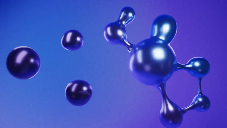
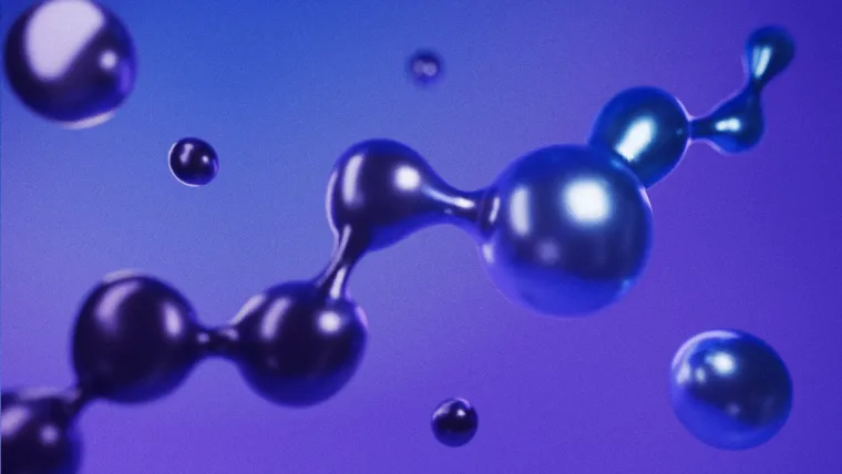
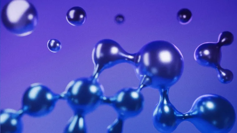
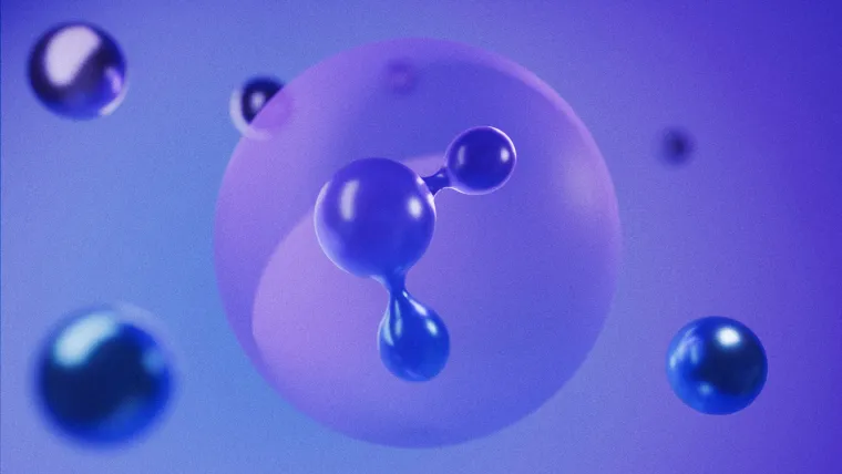
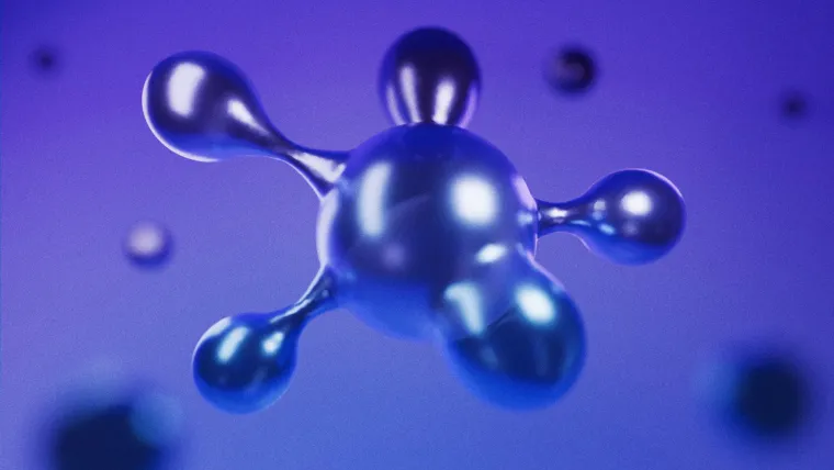
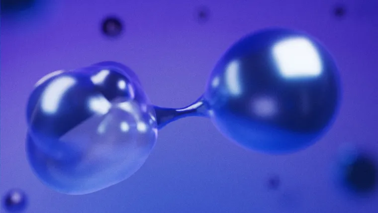
Every bead is a metaball: they fuse where they meet, which is what makes a chain rather than a row of touching spheres. They travel and they drift at the same time, so nothing in the frame is ever quite still.
The curves under the timeline are the easing, and they are where the motion stops being flat. A small sphere pulling away from a large one starts slowly, because separating costs it something; once it is free it gathers speed and floats off. The shader editor is where the beads get their metal.
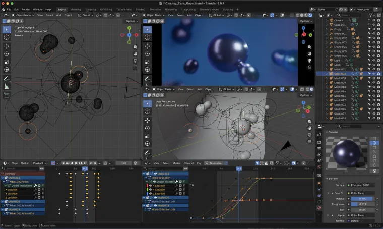 Blender: metaballs, dope sheet and curves
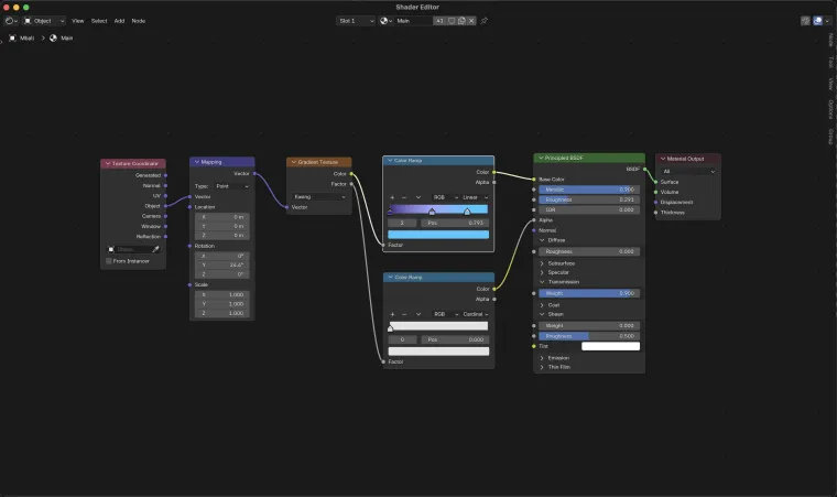 Blender: shader editor, the liquid metal
AI Content Supply Chain
The piece is about marketers and AI working as one, so the marketer is drawn as a monk with the parts of his job in orbit around him: each glowing sphere a zone he answers for, all of them held in order by the person at the centre. The AI carries the load and still cannot do the work without him. Inside, the campaign runs through five stages: one graphic draws the flow, the other splits what AI changes for the business from what it changes for the marketers.
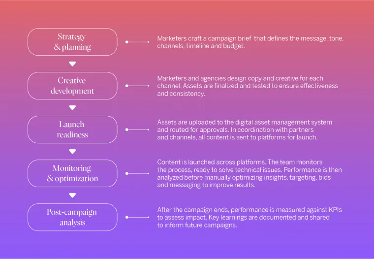
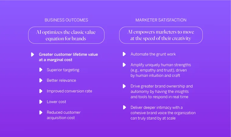
The Omni-Employee Era
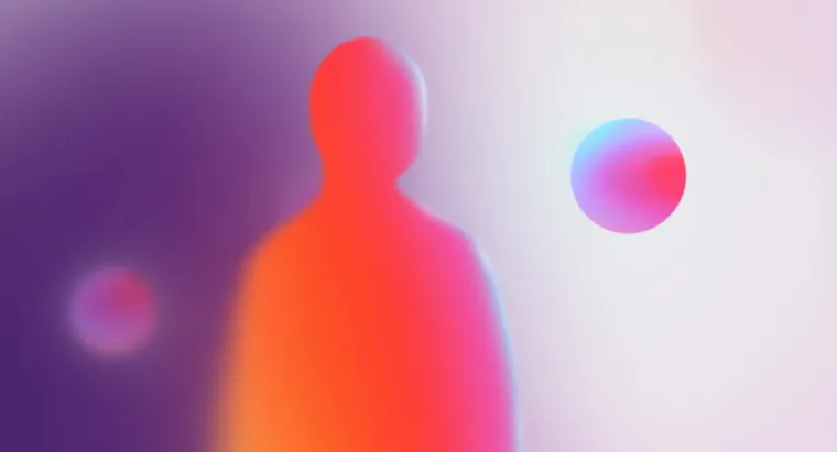
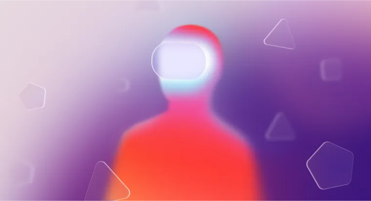
A piece on AI in retail: on using it to strengthen the people on the floor, not only to smooth things for customers online. The worker is the core, so the breathing orb at the centre is the living thing and the glass shapes around it are the AI. No two of those shapes are alike, because each one stands for a different place the help comes from. In the scenario illustrations the figure is a person outright, with the AI around him and never in place of him.


WEF × AI: the agentic playbook
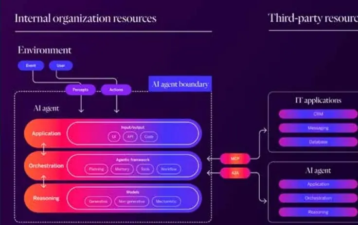
Written with the World Economic Forum, the piece is about AI agents and about how little any one of them is worth alone: the argument is the ecosystem, not the agent. So each agent is a capsule, the shape a pill takes, because that is how the thing is sold: a tablet that puts everything in order. There is a whole field of them, and the colour runs through the field in sequence, which is what makes it one system rather than a crowd. Inside the article the technical drawing takes over, in the publication’s own palette so it never reads as a slide someone pasted in.
Each row of pills is one layer with time remapping on it and a single line of expression underneath, so the build runs forever without a seam and no two rows pulse together. The colour is one gradient of nine stops from orange through red to violet, bent by two CC Flo Motion passes on an adjustment layer above. Nothing in the frame is rendered: the depth is 2D light standing in for 3D.
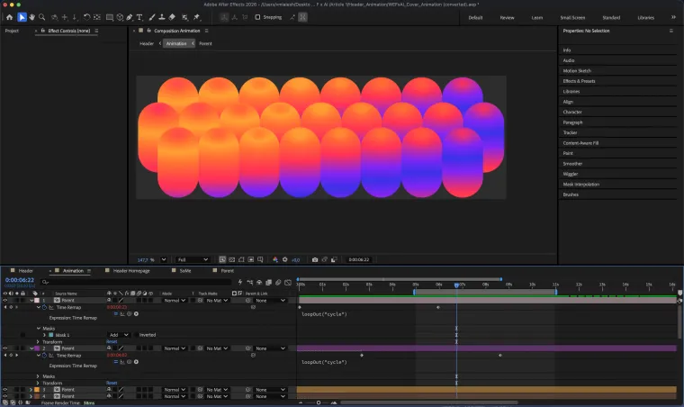 After Effects: the timeline, time remapping on every row
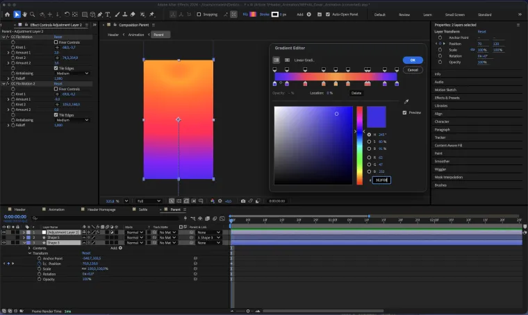 After Effects: the gradient editor
Next-Gen Contact Centers
The piece argues that AI stops being a helper in customer service and becomes load-bearing: the missing link between understanding a request and resolving it. The win is not the technology on its own but the chemistry between it and the people running it, which is why the article spells out an order: prevention first, then self-service, then the operators themselves. So the crystal at the centre is the AI, and the hands around it are what holds it, steers it and keeps it in check. Neither gets the result alone.

From Complexity to Clarity
The piece argues that a CMO has to climb out of operational chaos and back into marketing itself, and that the way out runs through learning AI properly rather than around the edges. So the figure is a conductor and the drifting glass bars are the instruments: the result comes from the person who knows how to bring them in. The bars were built as a 3D system rather than a single render, so the same setup produces the article lead, the social crops and the animation.
This is the only piece in the series I did not start. It came back from review marked all over, to be redone well and to be redone fast, so I rebuilt it from nothing and in 3D. The publication has redrawn its identity since; the 3D is still in it, in another palette and made with AI.
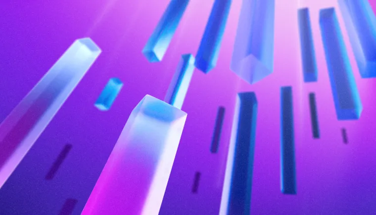
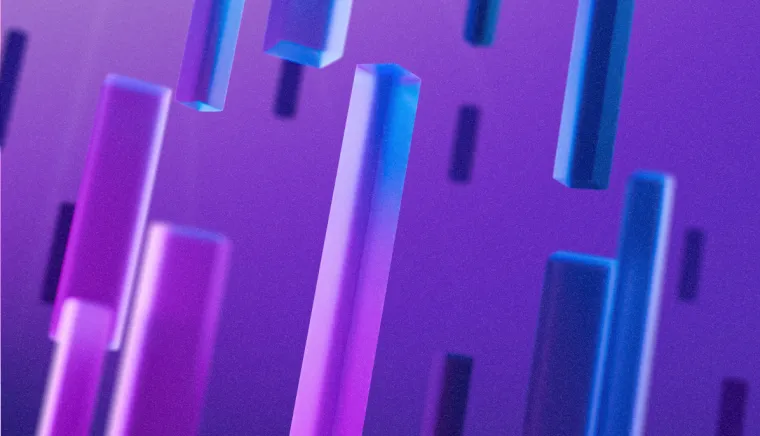

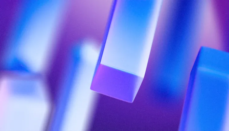
The conductor is one flat silhouette under a puppet mesh (density 10, expansion 3) with eight pins keyframed along the timeline. The figure conducts; the render only watches.
The working file
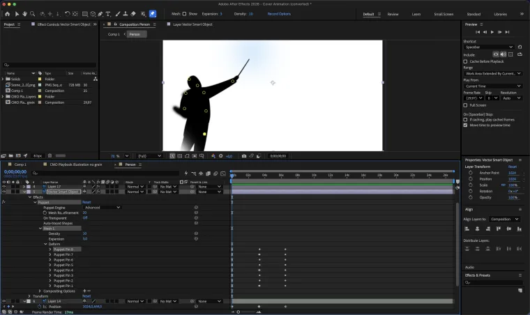 After Effects: the puppet mesh and its timeline
What the copywriter said
The series is written by frog’s content team, and its writers are the people who watch every key visual arrive. This is the copywriter quoted at the top of the page, from the same feedback round, on what happens now when a new piece is commissioned.
Her visual style regularly receives high praise, with stakeholders often referencing her previous projects when describing how they want their new project to look. This is perhaps the best feedback any of us can hope for. A copywriter on the series · internal feedback, July 2026
What I would still change
Next-Gen Contact Centers is the piece I would go back to. Its key visual is the only one in the series that does not move, and motion is the rule everywhere else. It is also the only article that arrives on its own: no process graphic, no scenario illustrations, nothing built around it to carry the argument further into the page.
That is not a decision I would defend, it is a deadline. At a week and a half to two weeks an article, the key visual is what gets made first and the set around it is what runs out of time. It is the one place where the language is stated and then not carried through.